We fell in love with Abubakar Ibrahim’s Season of Crimson Blossoms when it came out in 2015. A delicately woven love affair between Hajiya Binta Zubairu, a 55 year old widow, and Reza, a 25 year old thug, Ibrahim’s first novel got our attention for its grit and heart.
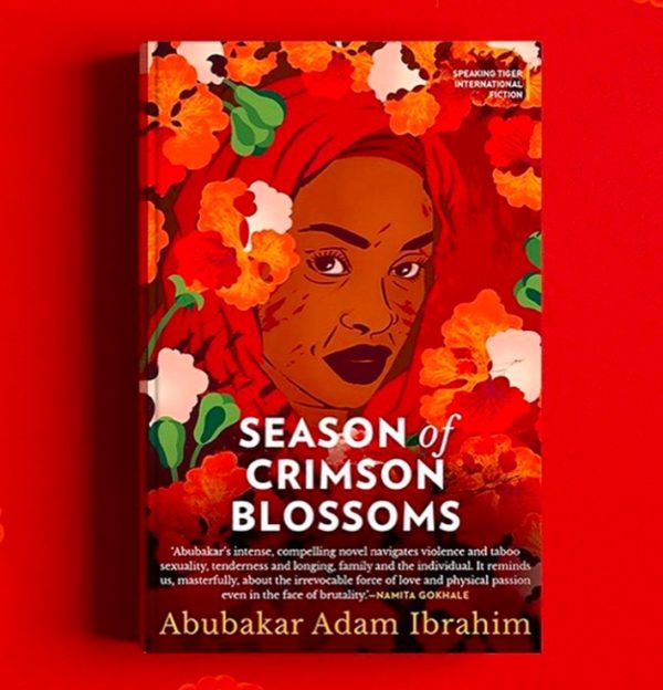
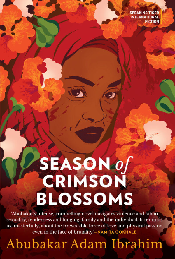
It looks like we now have yet another reason to love the book. Earlier this year, the Indian edition of the novel was published by Speaking Tiger under their International Fiction Series. As you can see from the image above, Speaking Tiger went for a show-stopping cover design. The image of flowers and a woman’s arresting face, all draped in red, is visually stunning. This is the kind of cover that inspires readers to pick up a book and read it!
A good cover design takes time, money, and (as you will see below) a lot of thought to execute, so we knew that a cover this incredible had to have a story. We tracked down the publisher to find out more, and Maithily Doshi, the creative director behind the cover art, had all the answers.
She details the journey from conception to commissioning Delhi-based illustrator Sudeepti Tucker. We found the story inspiring and thought it worth sharing.
The principal theme of the book is the quest for beauty/love amidst devastation. In one scene, Binta is visiting her younger, wealthy son Munkaila’s family in the capital, and she sees her granddaughter collecting flame-of-the-forest flowers:
“The courtyard, when they arrived, was strewn with the red blossoms of the lone flame tree, whose boughs stretched across the compound like probing fingers searching the sunlight. Under the tree, little Zahra was gathering the blossoms into a glass cup half filled with water, an unlit candle peeking over the top. […] ‘Zahra does this often,’ Munkaila placed a hand on his daughter’s head. ‘When the flame tree is in bloom, she collects the blossoms in a glass and lights a candle.’ ‘Season of crimson blossoms.’ There was something melancholic about the way Fa’iza said it. Her eyes were focused on the glass. Zahra beamed proudly. ‘I keep it in my room. All day. The candle goes off when it burns to the water level.’ ‘Blood.’ They all turned to look at Fa’iza. […]”
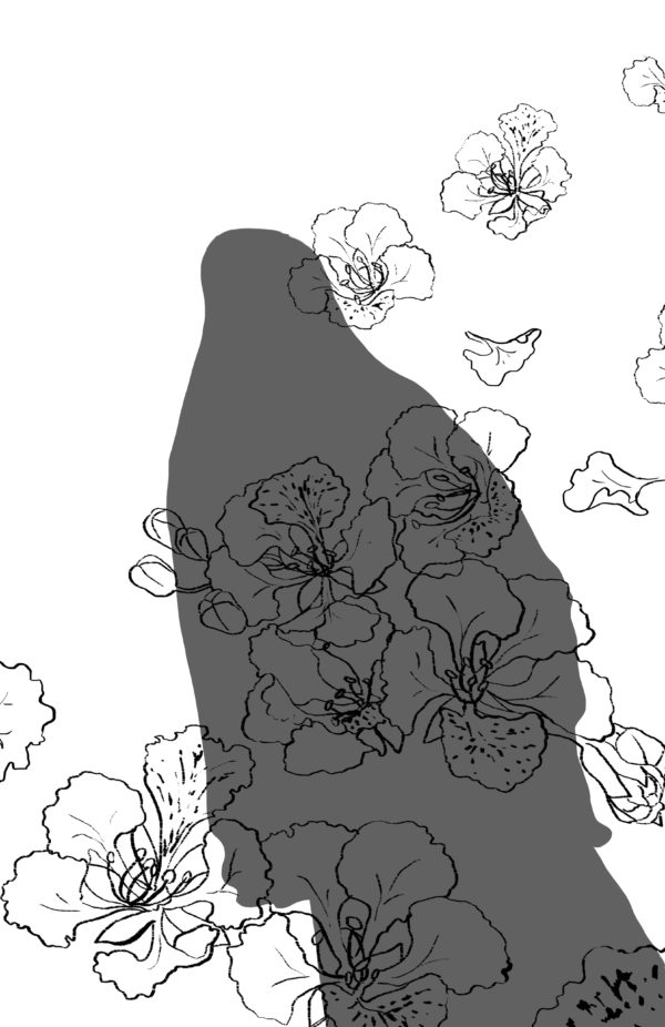
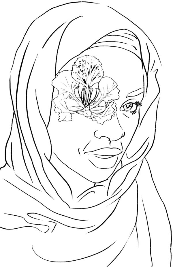
When I read the above extract from the book I only had this image of the red flowers scattered on the floor as the cover for the book. For me it was the perfect visual that would represent the book. But a photograph somehow didn’t do justice to the mood of the book. At this point, I started looking for an illustrator. While looking for the right kind of work, I came across Sudeepti Tucker…As we started working on the cover, the concept evolved from just the red flowers to flowers forming splatter of blood to the face with the flowers with some hidden splatters of blood. This to me was a perfect balance for something hopeful, beautiful between violence and devastation. We all were really happy with what we had finally, and it’s really heartening to see the response and feedback we have been getting.
See the evolution of the cover design by scrolling through the images below.


BUY BOOK | HERE
**************
Post image by Sudeepti Tucker via Instagram


COMMENTS -
Reader Interactions