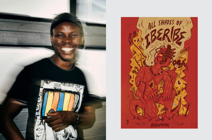
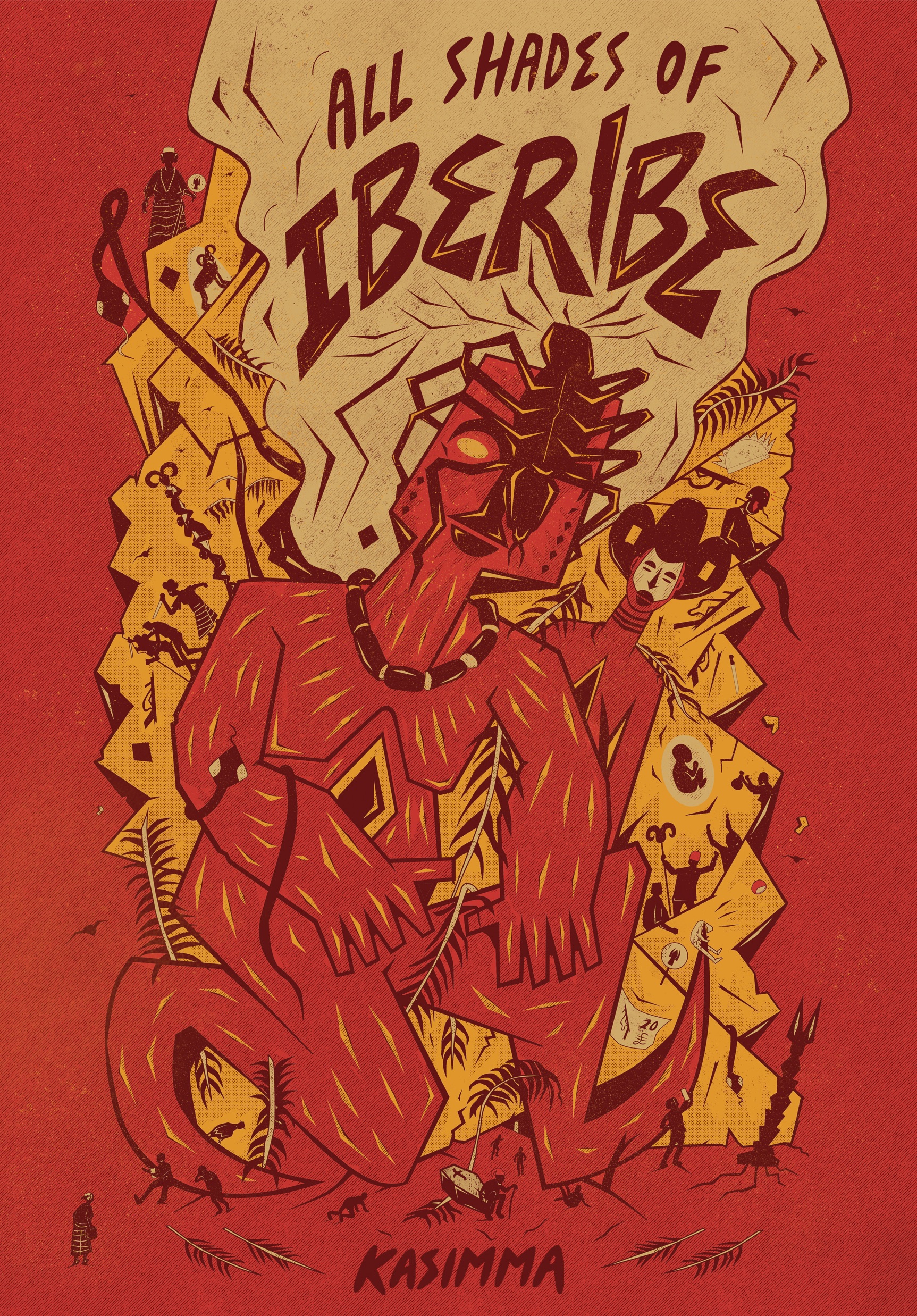
As the November publication of Kasimma’s All Shades of Iberibe approaches, we caught up with the artist behind the book’s gorgeous cover art.
Karo Akpokiere was trained at the celebrated Yaba College of Technology in Lagos. He has been featured in many exhibitions, including the Venice Biennale and has been commissioned by corporations such as Nike and various cultural institutions. As is evident in the cover art of Kasimma’s book, his style is distinct. According to his website, his artistic philosophy blends play and politics:
His approach to drawing is twofold. It revolves around how drawing can be used to project political, social, and personal realities and concerns itself with harnessing the power that drawing offers for ‘play’; play as a metaphor for spontaneous, creative freedom and the making of open-ended narratives that may be fictive and/or non-fictive.
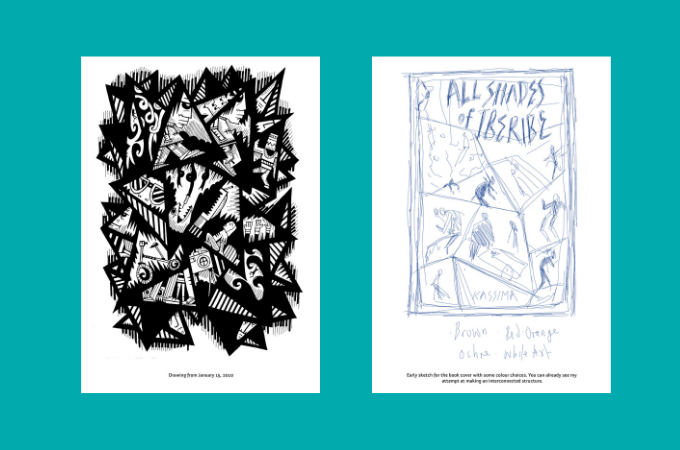
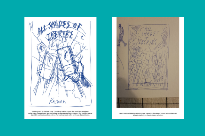
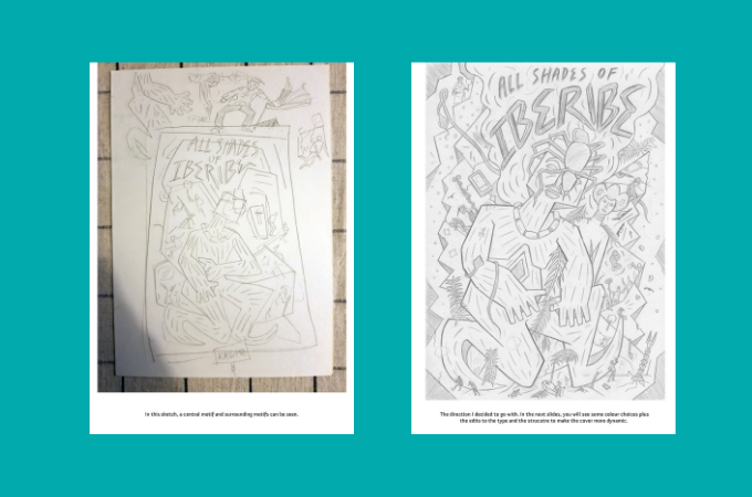
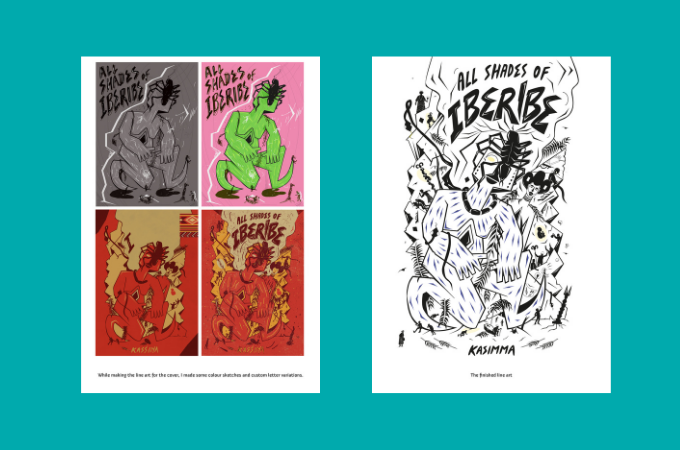
Sit tight as Akpokiere takes us behind the scenes to the artistic choices that went into the cover art of All Shades of Iberibe. Scroll down to see the visuals for the conceptualization of the book cover.
***
Brittle Paper
What inspired the cover design?
Karo Akpokiere
A drawing I created on the 15th of January, 2010 inspired the formal decisions I took regarding the cover. The drawing consists of multiple interconnected panels that serve as focal points for different types of activity. I liked the idea of using the drawing as a starting point for the cover as I felt its structure would lend itself well for a representation of short stories. I just had to figure out what each panel on the book cover would contain and how to determine the scale of the focal points.
Brittle Paper
What influences did you draw on?
Karo Akpokiere
It was a mixed bag of influences. I looked to the colors from Akwaete fabrics, Igbo mythology, the Nigerian civil war, Onitsha Market Literature, red cap chiefs and most importantly the synopsis of the book and, excerpts from the story collection.
Brittle Paper
What aspects of Kasimma’s work did you channel into the art?
Karo Akpokiere
The case of the missing grandfather seated atop a coffin and the palm tree branch from the story “My Late Grandfather.” This was an important aspect as it allowed me to determine an image that could be used as a symbolic and stylistic device for the cover, the image being the palm tree branch which appears as a recurring motif throughout the cover. The palm tree branch brought to my mind the culture of “Marriage in Abstentia” or proxy weddings. In this case, the branch replaced the grandfather. I found it interesting how an image that represents Palm Sunday’s triumphant entry of Jesus could be used as a stand in for death. I loved the contradiction it provided and, knew I had to use it!
Also, in one of my email exchanges with Buzz Poole ( the publisher), some images that the author found evocative were noted. It was a mix of spiders, tongues for feet, muscular arms etc. I guess you can tell where that information came in handy on the cover!
Brittle Paper
Thanks Karo for taking the time to chat with us and for indulging our curiosity about the story behind the cover.




COMMENTS -
Reader Interactions