Last week, we shared the UK cover of Nigerian writer Wole Talabi’s forthcoming heist novel Shigidi and the Brass Head of Obalufon with you all. This week, we are featuring the cover designer Jim Tierney in our #CoverStory series where book designers and artists get to share behind-the-scenes details on creating book covers. Tierney takes us through the stages of designing the cover of Talabi’s highly anticipated debut novel.
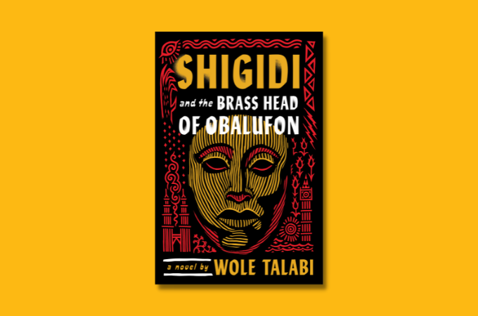
Shigidi and the Brass Head of Obalufon is set to publish on August 8 by DAW Books in the U.S. and Gollancz in the UK on the same day. While the UK edition of Shigidi has a museum at the center of the cover, the US edition features a bronze head sculpture (much like the Bronze Head from Ife). The color scheme is a vibrant yellow and red, and the cover is designed by the talented Jim Tierney.
A mythology-infused heist novel set in Lagos, Singapore, and London, Shigidi is a story about the titular nightmare god in the Yoruba pantheon who reluctantly answers the prayers of his few remaining believers. When he meets the succubus Nneoma, the two join hands and attempt to break free and live on their own terms. But the elder gods have a final job for Shigidi and Nneoma, a heist at the British Museum spanning two realms.
Enjoy our interview with the cover artist Tierney below.
***
Brittle Paper
Hello Jim. It’s great to chat with you. Your design of Wole Talabi’s forthcoming novel is beyond stunning. Can you tell us a bit about yourself and your work in general?
Jim Tierney
Thanks so much for the kind words. I’ve been designing and illustrating books for the last 13 years. After studying illustration at an art school in Philadelphia, I had a few in-house design jobs for publishers in NY, where I learned the basics of the publishing process, and had the privilege of working alongside some of the most talented designers in the world.
As my illustration work started to pick up, I went exclusively to freelance, and my wife and I finally left NY after the birth of our son in 2018. We now both work out of our home studio in Pennsylvania.
With a background in illustration, my natural approach to most design projects is to draw something out by hand. The final art is usually rendered and colored in Photoshop, with a digital drawing tablet.
Brittle Paper
What were some of the conceptual and aesthetic elements that went into creating the cover of Shigidi?
Jim Tierney
I knew from the beginning that the author wanted the design to feel colorful and dreamy (the main character is the Yoruba god of nightmares), and to incorporate motifs from locations in the story (Lagos, London, Malaysia, Singapore, Algeria). With that loose framework as a guide, the rest of the elements came from the story, including the titular Bronze Head.
Brittle Paper
How did you incorporate Talabi’s vision and ideas into the cover art design?
Jim Tierney
The globe-spanning narrative immediately gave me plenty of imagery to work with, and the addition of shape-shifting gods and ancient magic allowed me the freedom to take things in a weird and surreal direction.
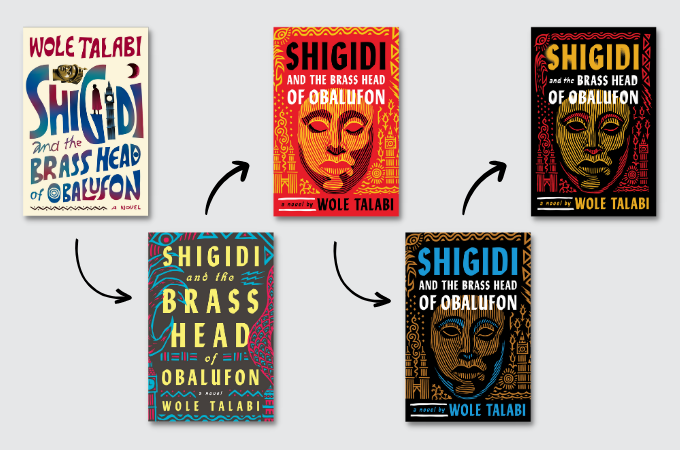
With such an intriguing title, I knew the lettering would have to be the central element, with the rest of the imagery incorporated around the text. After we decided on using the big Brass Head as the central illustration, I tried out a few color and type variations before we settled on a vibrant yellow and red against black.
Brittle Paper
Were there any challenges along the way?
Jim Tierney
The freedom of working with such an epic and magical story is always balanced by the question “How do I fit all this into a 6 x 9 rectangle?”
There was also a challenge in how to show so many locations and cultures without making the design look too busy or mismatched. To help unify the imagery, I based the illustrations on the bold style of Nigerian art and textile patterns.
Brittle Paper
Were there any design trends that you tapped into while creating the cover?
Jim Tierney
That’s always hard to answer since a lot of those decisions are made unconsciously based on what “feels” right, but I guess I wanted the whole design to feel low-tech—like it could have been screen printed or block-stamped—to avoid pinning it to any specific era or location.
The limited colors and bold patterns help give the design a timeless effect, like it could either be as ancient as the gods, or as contemporary as a concert poster.
I also tried out a few different styles of very expressive hand-lettering to accentuate this effect (although in the end we decided to use a set typeface on the final cover).
Brittle Paper
With digital culture centering visual art within cultural life, I imagine that book design is an interesting space to be at the moment. What would you say is the general state of the field?
Jim Tierney
From my perspective things are pretty good! I know publishing at large is going through a lot of challenges and consolidations, but young people are generally reading more books than they used to, and there seems to be a much wider range of voices making it to print than even 5-10 years ago. On the personal side, I’m very lucky that the styles and genres I tend to work in (mythology, sci-fi, fantasy) are becoming more widely popular.
Brittle Paper
What is your take on how important a book cover is in terms of attracting readers and selling books?
Jim Tierney
Of course it’s hard to tell from my biased perspective, but I think the fact that all of the biggest marketing platforms (TikTok, Instagram, Amazon) are increasingly visual and impulse-based means there’s more pressure on the cover design to make a quick and lasting impact. When your first impression of a book is seeing it flash by as a 200 pixel-wide thumbnail, the design can make a big difference in whether you decide to give it any more of your attention or not.
Brittle Paper
Finally, what is the conversation around AI-generated art in the book design space?
Jim Tierney
Since leaving NY, I’ve fallen out of the loop on the current “design conversations”, but I imagine this topic is causing some trouble for Rights Managers and stock houses. Cover designers use a LOT of stock imagery from places like Getty and Shutterstock, which obtain their images from third-party stock artists. I’m sure they are being flooded with AI stuff these days, and it must be a nightmare to vet everything properly for copyright, contributor credit, model release, and so on.
Brittle Paper
Again, congrats on such a brilliant cover. Thanks for taking the time to chat with us.
Jim Tierney
Thank you so much for the opportunity!
***
Preorder Shigidi and the Brass Head of Obalufon by Wole Talabi: Amazon | Penguin | Gollancz (UK)


COMMENTS -
Reader Interactions